Saturday, January 19, 2013

Thursday, October 25, 2012

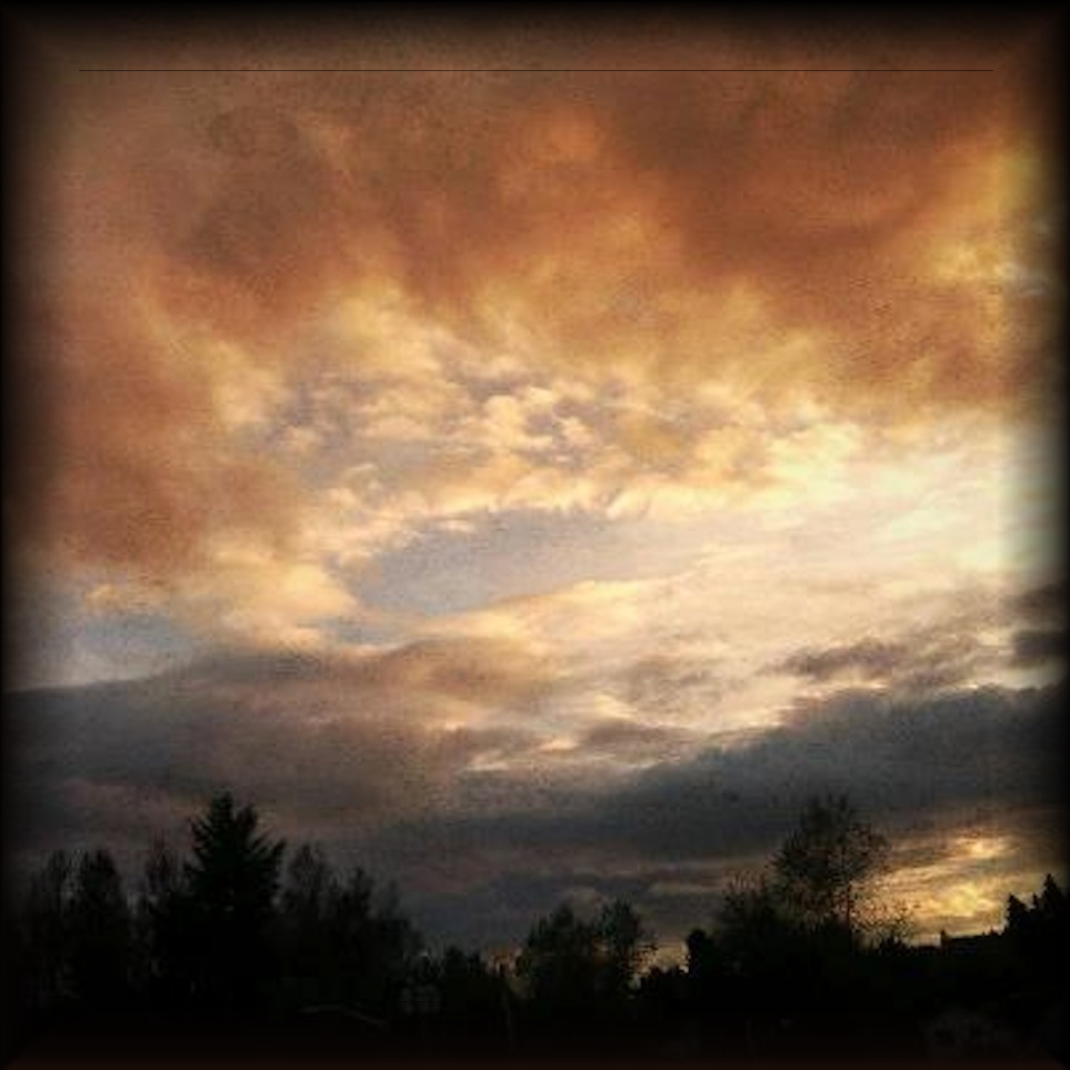
Evening Song


I seem to have a great affinity for clouds and the sky. 
The ephemeral beauty of the light just seems like magic to me.
 I happened to be a passenger yesterday and 
couldn't stop myself from snapping some shots of this mesmerizing evening sky!

Monday, October 8, 2012

Mossy : Mandarin Orange Monday


A quote from Marianne Williamson:
"We can always choose to perceive things differently. 
You can focus on what's wrong in your life or you can focus on what's right ."

Not quite a screaming orange but a hint enough for Mandarin Orange Monday I hope

Monday, October 1, 2012

Mandarin Orange Monday!

Since I'm a real fan of the color orange I simply have to participate in Mandarin Orange Monday!

This is an image of crocosmia - one of favorite summer time blooms!

5 Fact Friday - a little late!


ROF
Late is better than never! As long as I manage to get links up within a week I think I'm doing well!

5 more factoids :

1.     I collect feathers - and believe that they are messages from above.
2.     I love living in a rural area. I never felt 'comfortable' when I lived in a city.
3.     I'm slowly beginning to like the color pink - it was always a color I avoided in the past.
4.     I believe in angels.
5.     Our yard is inhabited by crows, eagles, hawks, raccoons, deer, cats, fox and many birds!

Saturday, September 29, 2012

Twigged : Kim Klassen's Texture Tuesday " Better Late Than Never!

I couldn't resist this simple twig - misplace, somehow, on a deck.
This one contains a texture from Kim Klassen called 'Scripted Autumn'

I'm having such a wonderful time re-connecting with my imagery obsession - and in the way I always envisioned that I could.  I'm glad I kept my cameras - even the SLR's!

Sunday, September 23, 2012

Kat Sloma's Exploring With A Camera: Allowing Space


This is the Cattle Point Lighthouse as seen from American Camp on San Juan Island Washington.

Kat Sloma's "Exploring With A Camera" theme this month is 'Allowing For Space'. It's an important thing to remember and is all too easy to overlook at times. As with any art work, the eye needs a place to rest when looking at an image. Too much color and information can be as 'off-putting' as too little in the composition of an image that is pleasing to the eye. 

I have to admit to being layer addicted but there are times when color and simplicity can really make an image powerful. I chose this image that is not as simple as I had originally planned, because it has two contrasting colors and both areas offer a lot of space within their nearly diagonal spaces. I liked the sinuous curve that the road  line added to the image as well. Not quite as much space as I could have gone for - but fits the theme none-the-less I hope. Thanks Kat for another fabulous reminder and lesson!